Comprehensive redesign that led to a 7.5% increase in CVR
Accounting for nearly half of all traffic entering Cameo, profile pages are the consumer-facing storefront for talent. As Cameo grew and we began offering a larger variety of products, we discovered that the suboptimal design of profile pages became a bottleneck that kept fans and talent from creating magical moments. I led product design, built high-fidelity prototypes in both Figma and Framer, ran design sprints, ran user testing, and presented to stakeholders including our executive leadership.
Client
Cameo
Role
Product design
Product strategy
High-fidelity prototyping
User research
User testing
Competitive analysis
Design system
Tools
Figma
Framer
UserTesting.com
Userlytics
Looker
Eppo

Design principles
The problem with the current profile page is that it doesn’t scale with multiple products, it lacks user education and trust elements, and limits the connection Talent can build with their fans. The profile page redesign allows users to learn if that Talent is right for them, easily understand all the fan experiences they offer, and feel confident that making a purchase will result in an experience that is truly personalized and authentic.
Flexible
The profile page meets customer demand by featuring the products most relevant to a customer whether one product or all products are being sold.
Fresh
The profile page updates over time to reflect changes in the Talent’s status, promotions they’re a part of, and causes they support.
Representative
The profile page speaks in the Talent’s voice as Talent creates content promoting themselves and the products they sell.
Clear
The profile page makes clear how consumers can take action and each page is simple and familiar.
Scalable
The profile page features scalable components for its various elements.
Advancing
The profile page enables users on the ‘wrong’ profile to find their way to the ‘right’ profile for them. No dead ends.
Ideation
With our initial design principles in place, we further refined those principles and our requirements in general by running multiple design sprints with stakeholders from nearly every team. Those learnings became the foundation for the hundreds of design explorations that we would explore and test in the coming months.
Design sprints
Because nearly half of all traffic that lands on Cameo lands directly on the profile page, it made sense to involve subject matter experts from almost every team at the company including product, design, engineering, marketing, talent reps, and more. Our process began with understanding each team’s goals via presentations and Q&As followed by “How Might We” driven ideation, crazy 8 sketching, and prototyping.

Design sprint

Metadata brainstorm


1:1 explorations
As a design exercise to get us thinking outside of the bounds of our existing experience, we selected a handful of other products like Bandcamp, MasterClass, and DoorDash/Uber Eats and populated our content into their layouts. This allowed us to explore more divergent design options and evaluate the pros and cons of each approach. Next, we created a hybrid design with the best features of each exploration and that laid the foundation for many of the elements we launched with.

Bandcamp

MasterClass

DoorDash/Uber Eats

Hybrid
Design iterations and testing
After designing a foundation that supported our goals, we went through hundreds of design iterations and ran dozens of user tests with high-fidelity prototypes. We primarily focused on a variety of header lockups, ways to visualize and lay out product cards/CTAs, navigation structures, and striking the right balance between clarity and conciseness of product education. Eventually we worked our way towards a design that aligned with our business goal of flattening the hierarchy between product offerings via a product agnostic header while providing ample space to educate users about each product offered via individual product cards.


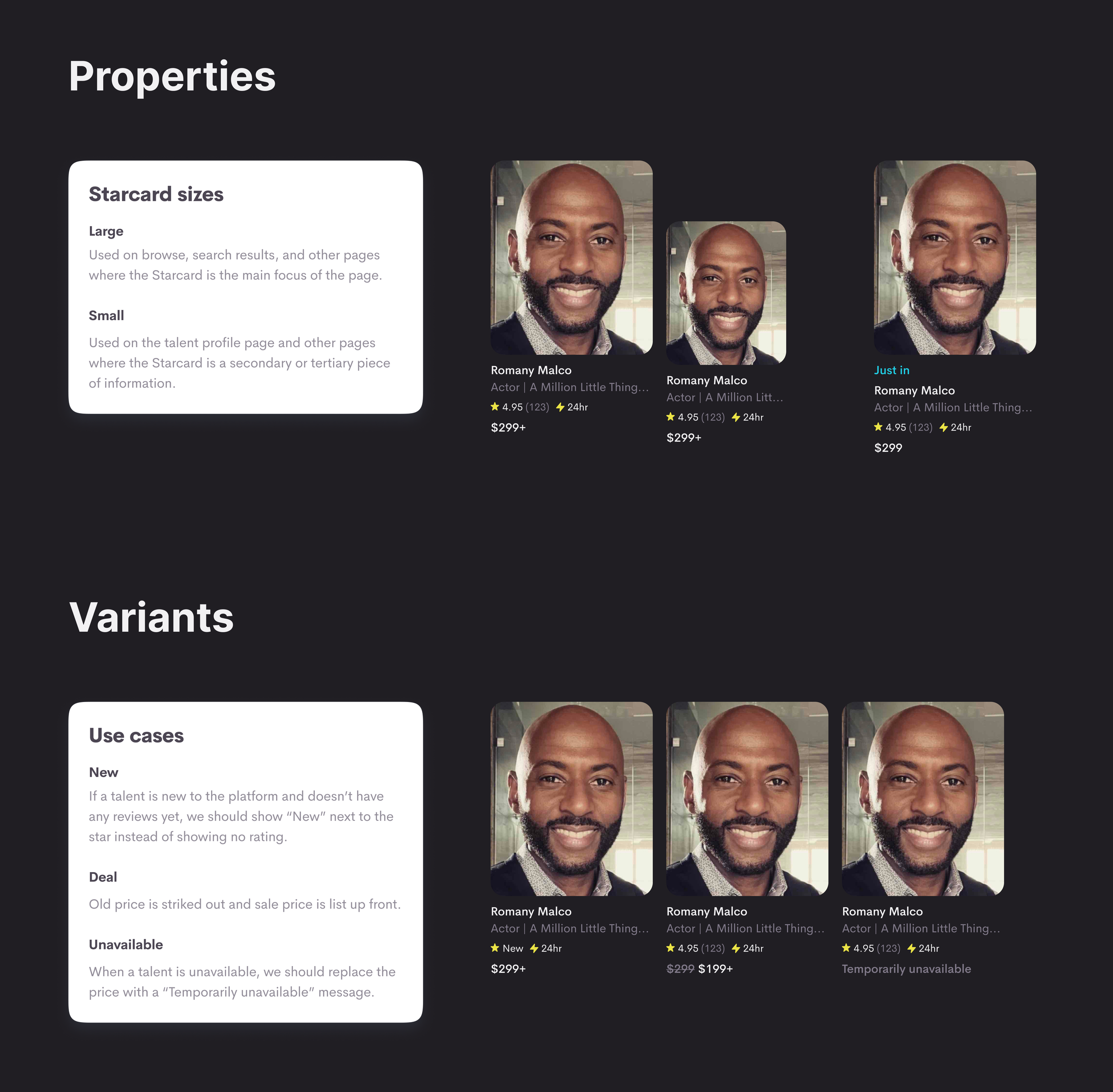
Flex and scale
As we refined our designs with every round of testing, internal stakeholder reviews, and iteration we went through, the cornerstone of the profile page redesign became a completely flexible page layout populated by scaling product cards that we’d display in small, medium, large, or full page configurations depending on what platform and how many products a given Talent offered.


Personal Cameo

Business Cameo

Events

Merch

DMs
Keep it fresh
One of the user pain points we identified with the existing profile page was a difficulty or outright inability to know if there was something timely going on with the Talent, such as promotions, upcoming events, availability, and more. From the Talent perspective, any follow feed content that they posted only appeared in the app and even then it wasn’t surfaced onto their profile. This severely limited their ability to communicate with their fans and keep their profiles feeling dynamic and timely.
Fresh box
The “Fresh box” was a component of our dynamic card system which kept fans informed about things like a Talent’s availability, promotions, merch drops, upcoming events, and more.
Follow
At the time, encouraging fans to follow Talent was a big part of our strategy to drive engagement and conversion. We were able to let followers know about things like limited edition merch drops before anyone else.
Latest feed
Superfans loved following Talent to receive exclusive updates while Talent loved being able to connect with their fans on a deeper level. So, we added a content feed to the new profile— its first implementation on web.
Building trust
Interviews and testing sessions with existing and potential users revealed a desire for more information about the Talent, the specifics of their product offerings, and Cameo as a whole. The feedback we heard the most was a desire for more context to ratings and reviews, examples of past videos and how long they’ll be, and more education about what to expect when booking.
Ratings and reviews
We took the previous implementation of ratings and reviews to another level by adding a breakdown chart, ability to filter by star rating, highest rated occasion types, and the actual video the review was related to.
Talent highlights
Users commonly asked for more details about the video they’d receive from the Talent after booking, so we created a section to house details like 24hr availability, video length, and languages spoken.
Product education
Because nearly half of the traffic to Cameo lands directly on a Talent profile page, it was important to surface education components like “How it works” and FAQs which previously only appeared on the homepage.
Design language
The profile page redesign is the project where we defined the new design language that would eventually be implemented across the rest of the consumer and talent products. This included new colors, simplified fonts, a new grid and spacing rules, corner radii, and the creation of scalable Figma components with variants and auto-layout.

Before

After
Launch
After all the user testing, design iterations, and stakeholder reviews, we reached design complete on the Talent profile redesign. As we continued to support engineering through the implementation phase and perform exhaustive QA sessions within the company, we also worked with the marketing and talent teams to prepare our go-to-market strategy. We also worked closely with our data science team to observe the results of the launch and plan out fast-follows based on our learnings.

Before

After
Go-to-market strategy
One of the most unique challenges of the Talent profile redesign was how expansive the scope was— we weren’t just launching a consumer-facing update, but we were changing the foundation of the storefront that Talent used to make money and connect with their fans. So, our go-to-market strategy was centered around educating Talent about the benefits of the updates we were making to their storefronts.
As the first step in our Talent CRM journey, we sent out an email outlining the key changes we’d made and invited them to visit a landing page with more details.
In-app notification
Talent can only fulfill booking requests via the app, so 100% of active talent are app users. We sent out an in-app notification driving talent to the landing page to learn more.
Landing page
We designed a comprehensive landing page with details about all the changes we’d made to the profile page and how they’d benefit Talent.
Learnings
Being able to observe and understand the results of our redesign was just as important as the redesign itself, so we worked closely with our data science, customer service, and talent care teams to gather data. Once our A/B test was complete, we distilled the data down into actionable learnings and next steps.
Larger profile picture
Larger pictures did help with recognizability of Talent who weren’t instantly recognizable in their videos, like those who portrayed an iconic role years or decades prior, but it pushed important details and actions too far down the page.
Trust and education
The feedback on trust and education elements was universally positive. We struck the right balance of informative without being overwhelming and made users feel more confident when booking Talent.
Product cards and flattened hierarchy
Though we met our business goal of making profile pages product agnostic, most users were still coming to Cameo to book a personalized video and the lack of a persistent, primary CTA led to a drop in conversion.


Designing for a moving target
Shortly after the initial launch of the profile page redesign, there were some major changes within Cameo that had us iterating on many of the initial changes we implemented. As a company, we planned to phase out most of our product offerings and renew our focus on personalized videos, business videos, and DMs.
Before

After
Simplified product offerings
Simplifying our product offerings was a major shift in thinking from our initial approach to the profile page redesign since, at its core, it was designed to make browsing and learning about multiple products on a lengthy page as easy as possible. However, it did afford us an opportunity to address the issues we discovered during the A/B test.
Renewed focus
With the removal of most products, we were able to craft a highly-focused profile page where all content was in support of one goal— driving users towards a clear call to action.
Grouping important actions
Adding a right rail with all important CTAs and information aimed at driving conversion ultimately reduced the “pinballing” of a user’s attention from left-to-right as they browsed the page.
Persistent book button
Another benefit of reintroducing a tiered product hierarchy was being able to anchor a persistent book button on mobile web as users scrolled down the page.
More education and trust
Since we received resoundingly positive feedback on all of the education and trust elements we introduced during our initial redesign, we decided to take it a step further and implement even more ways to help users feel confident in making a purchase for themselves or their loved ones.
Contextualizing videos and reviews
Users frequently cited videos and reviews as two of the key factors in their purchase decision. Since we surfaced the relevant video into the review previously, we decided to go a step further and surface the review onto the video as well.
Talent badges
With over 30,000 talent on the platform, it can be challenging for users to understand which ones meet their needs. By surfacing badges onto high-ranking talent profiles, we were able to provide users with additional context they previously lacked.
Purchase with confidence
A question that came up often in user testing was what would happen if a video request wasn’t completed. We decided to provide transparency into our refund policy so users felt confident making a booking.
User pathing
Because of the technical advancements we made during implementation of the initial profile page redesign, we were able to serve different types of users with different variations of the profile page and increase the likelihood of meeting their needs at that time. For example, if a user landed on a profile page after browsing for Talent that offer business videos, we were able to move business information to the top of the page and change the primary CTA from personal to business. Or if a user landed on Cameo via a link on social media, we could serve up a link-in-bio style site that’s focused on CTAs only since we hypothesized existing fans may need less education and convincing to convert.

Business pathing

Link-in-bio style page
Results
+7.5%
increase in CVR
+$3M
increase in annual GMV
Future vision
We saw great success from the latest round of profile page updates and since we’d made it a priority to build with flexibility and scalability in mind right from the very start, we could adapt and iterate quickly even in the face of major business shifts. When Cameo decided to allow non-celebrities to join the platform as talent, we knew that applying those same principles would be crucial to support use cases well beyond what we’d designed for previously.
Make use cases the entry point
As we continued to learn more about our users and their thought processes when booking Talent, we rallied around the idea of selling the benefit rather than the feature.
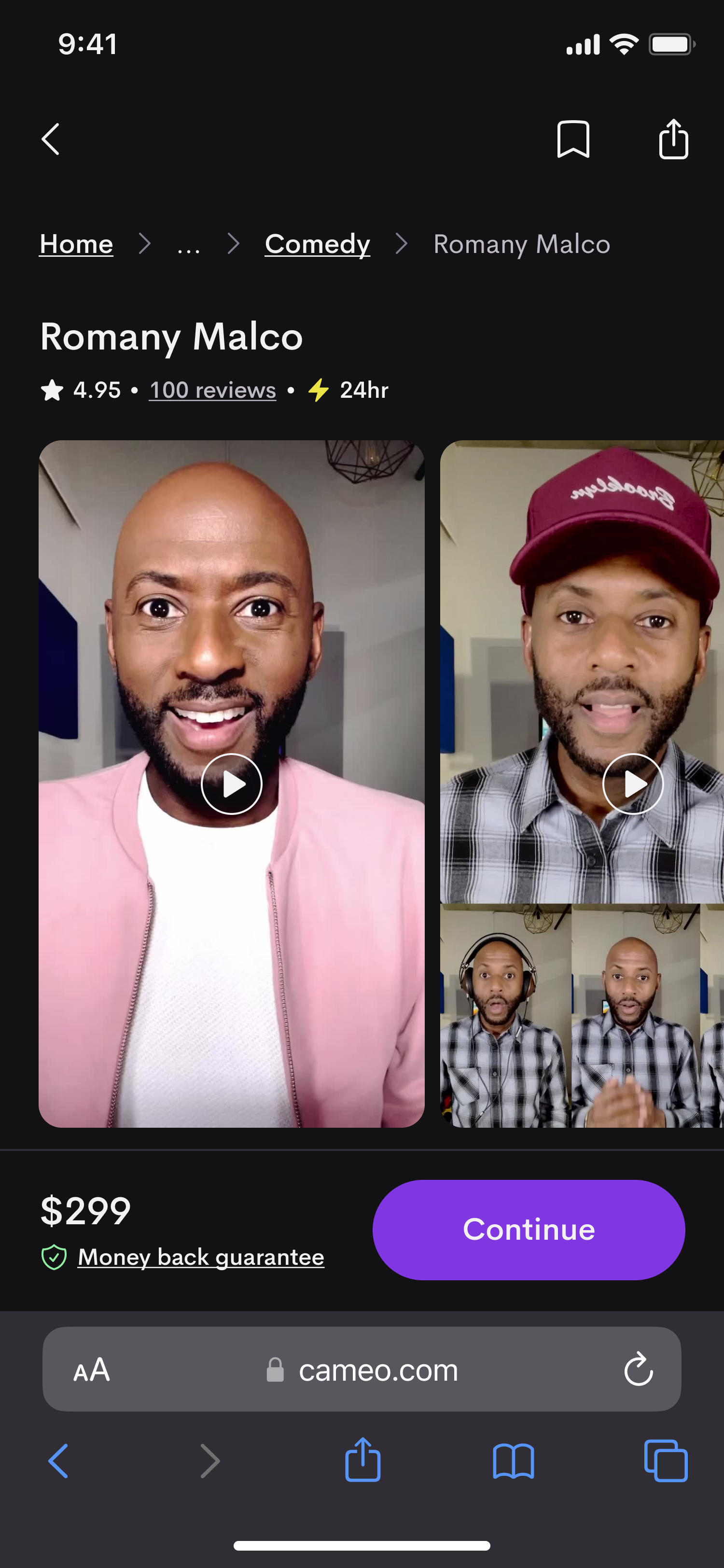
Custom offerings
When booking a personalized video, users choose from a preset list of use cases, but by opening the platform to a much larger variety of Talent, we wanted to allow them to create custom use cases that would resonate with their fans.
Powerful building blocks
The culmination of all the hard work we’d done on the profile page redesign was an optimized layout with a huge variety of flexible components that made iterating on new ideas and layouts faster than ever, no matter what the future holds.